
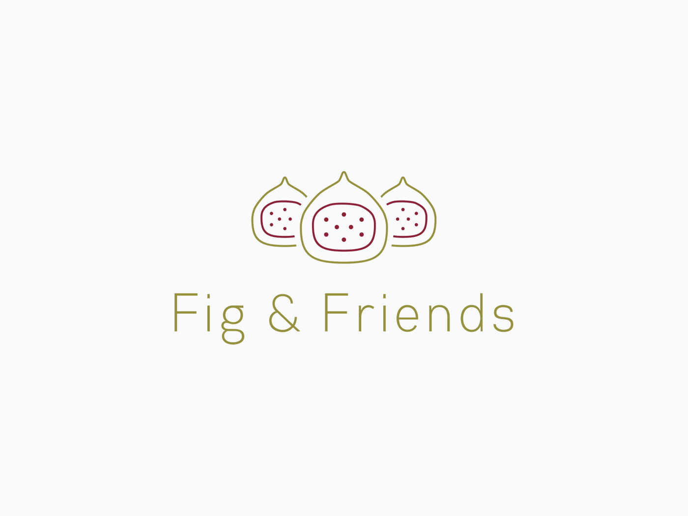

Client // Fig & Friends
Category // Logo design
Skills // Illustrator
Details // The client (a marketing consultant) did not want a classic corporate business consulting brand / logo. They found the fig tree and its ecosystem very fascinating. They liked the symbolism of them helping out a business as part of their ecosystem, making them grow, just like the fig is part of a huge ecosystem of species. The simple icon of an open fig fruit seemed more in line with this brand than a generic looking tree. And seeing as it's "& Friends", then have more than one fig made sense.